Logo Variations Every Business Should Have
Every business knows they need to have a logo - it’s your brand, after all! I mean, you look at a specific swoosh and know instantly it’s Nike...or a yellow M says McDonald’s… Both of those companies found a logo that worked for them and then they plastered it on everything. It took a while, but now they don’t even need to have their name on their advertisements - we know them by their logo alone!
But every business should have a variety of logos - at least variations of their logo. Here are four of them that I think you need and why - and where you should use them!
First, what is a variation of your logo? Logo variations are modified versions of your brand; they are similar to each other and keep you consistent across all designs and platforms (print and digital). This will ensure that you can be flexible and won’t stretch or squeeze your logo into different designs.
To help explain, I will use my own logo as an example.
1. Primary Logo
This logo is the most complex and intricate of the logo variations. It will often contain text only (a water/wordmark), a combo of text and an illustration or icon unique to your brand. It may also contain a tagline (location information or year of establishment or saying). Places to use: larger displays (website headers), brochures, cards, etc.
2. Secondary Logo
The secondary/alternate logo is a simplified version of your Primary Logo. It may be tighter or more narrow and more compact, allowing you to use it in a place where there isn’t much width space. It can be a stacked if your primary logo is a very horizontal logo (like mine). Places to use: social media or small print items (business cards)
3. Icon/Submark
This is an even simpler version of your logo. It sometimes may still contain your full business name, but typically will be just the initials or brand icon/illustration. These are smaller and are usually circular or square, making them perfect for places where a primary or secondary logo wouldn’t fit very well. Places to use: social media profile, website footer, Pinterest/blog graphics, stickers, presentation slides, watermark on video.
Favicon: A favicon (or browser icon) is a small 16x16 pixel icon that shows in the tab on web browsers before the title of your website. It serves as branding for your website. It is simple and minimal and is usually the brand icon/illustration or initials. Places to use: on web browser
4. Brand Elements
These really depend on your business. Some brands may have other tag lines or icons. They can be stripped down minimal versions of their logos. Places to use: social media, print items
Does your brand have logo variations?
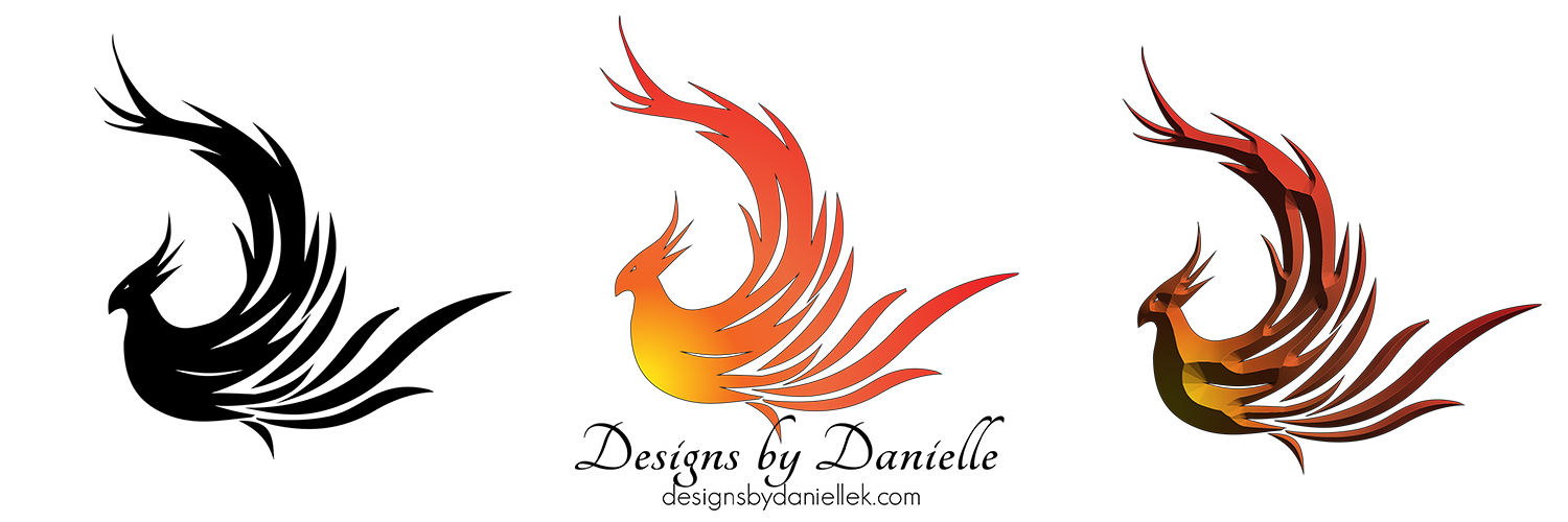
Besides these four variations in your brand colors, I also recommend them in black and white. Whenever I give a branding package to a client, I always include every variation in full color, and also in b/w for flexibility in placement! Plus, a vector version and ones with transparent backgrounds so they can place them on images as watermarks. I hope this helped you understand what logo variations are, why you need them, and how to use them in your business. Logo variations will give your brand a consistent look when using both print and digital.
If you need help redesigning or coming up with a consistent look for your business, drop me a line - I’d love to chat!


