Project Reveal: TOAD Theatre Summer Camp Graphics

This spring I was contracted by TOAD Theatre to come up with graphics for their summer camps, but I needed two versions - one for sign ups (so both shows would be advertised on one poster) and one for each of them for performances.

I decided on a deep purple background with some sparkle floating over "Beauty and the Beast, Jr" and drifting into the fanciful poms of "Seussical, Jr".
When it came time to create the graphics for their performance posters, I wanted each one to be unique from the other, but still carry a similar theme. So the final performance posters still kept the deep purple as their backgrounds (pictured at the beginning of this post), but they were still different from each other in feel and fonts!
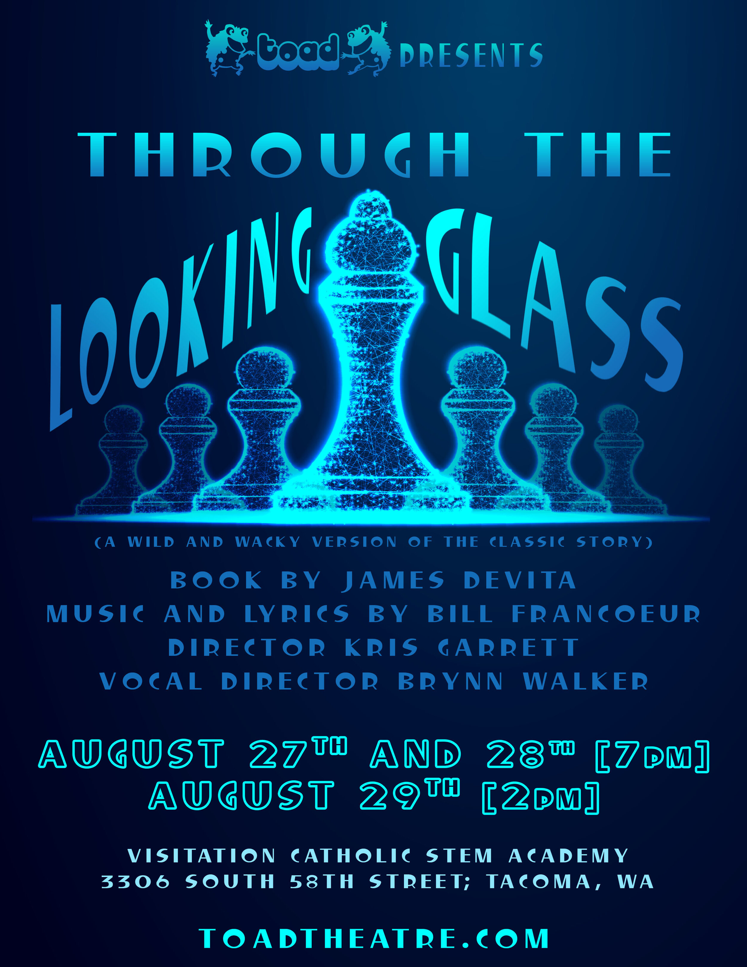
"Through the Looking Glass" is a summer camp produced by TOAD in Tacoma this August. What they loved about this look was that it was striking and captured their attention and eye! What I loved about it - I love that the story of the main character moving from pawn to queen is shown through the image and that the chess pieces almost have that "glass-like" character to them.
“Thank you, TOAD, for working with me again this year to create these fun designs for you!”