
From Idea to Design: A Government-Style Campaign Concept
I was recently asked to create a fictional public-facing campaign for a fictional government agency. The prompt was to create a social media graphic for an event of my choosing, so I chose to create a “Community Preparedness Day”. The goal was to communicate emergency preparedness in a way that felt approachable, not overwhelming, for a broad public audience.
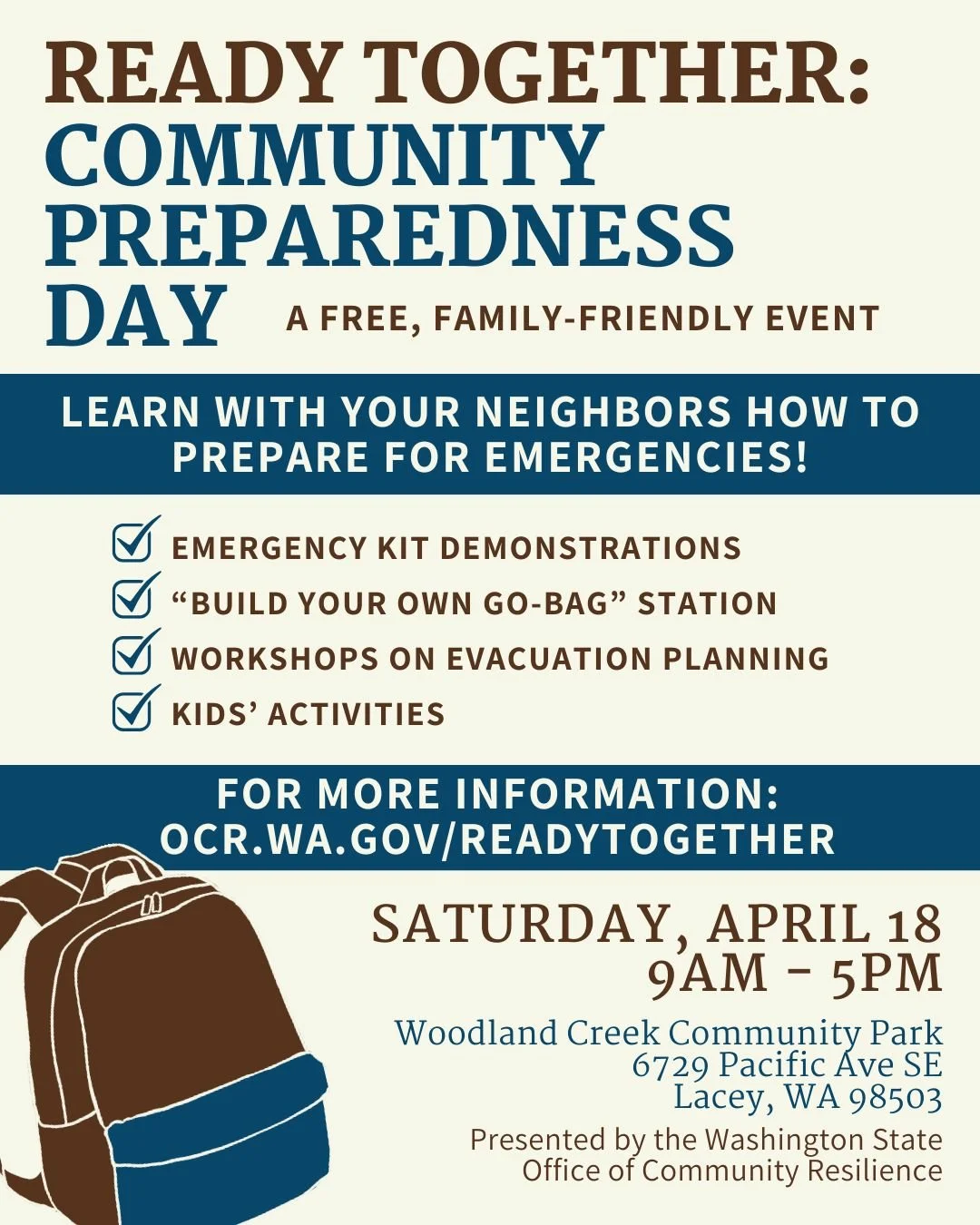
My challenge in this flyer was that public information can easily feel overwhelming or overly technical. I wanted to avoid that and instead focus on clarity, warmth, and accessibility.
My approach:
Designed for quick scanning
Focused on clear hierarchy
Avoided fear-based messaging
Used familiar, relatable visuals
Design Decisions:
Blue color palette → trust and government tone
Checklist icons → easy to scan
Backpack illustration → reinforces “go-bag” concept
Clear URL placement → simple next step
The final design communicates key information clearly while maintaining a welcoming, community-focused tone. It’s designed to work across print and digital formats and aligns with how public agencies communicate with broad audiences.
“
This was a concept project, but it reflects the kind of work I enjoy; creating clear, accessible communication that helps people navigate real-life decisions.”