
Color Psychology 101
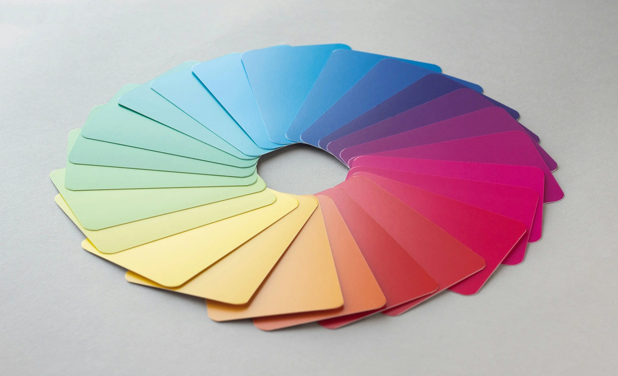
Color isn’t just decoration; it influences how we think, feel, and respond. Whether we realize it or not, certain colors spark specific emotions and associations. Understanding these reactions helps us create stronger, more intentional designs that connect with people on a deeper level.
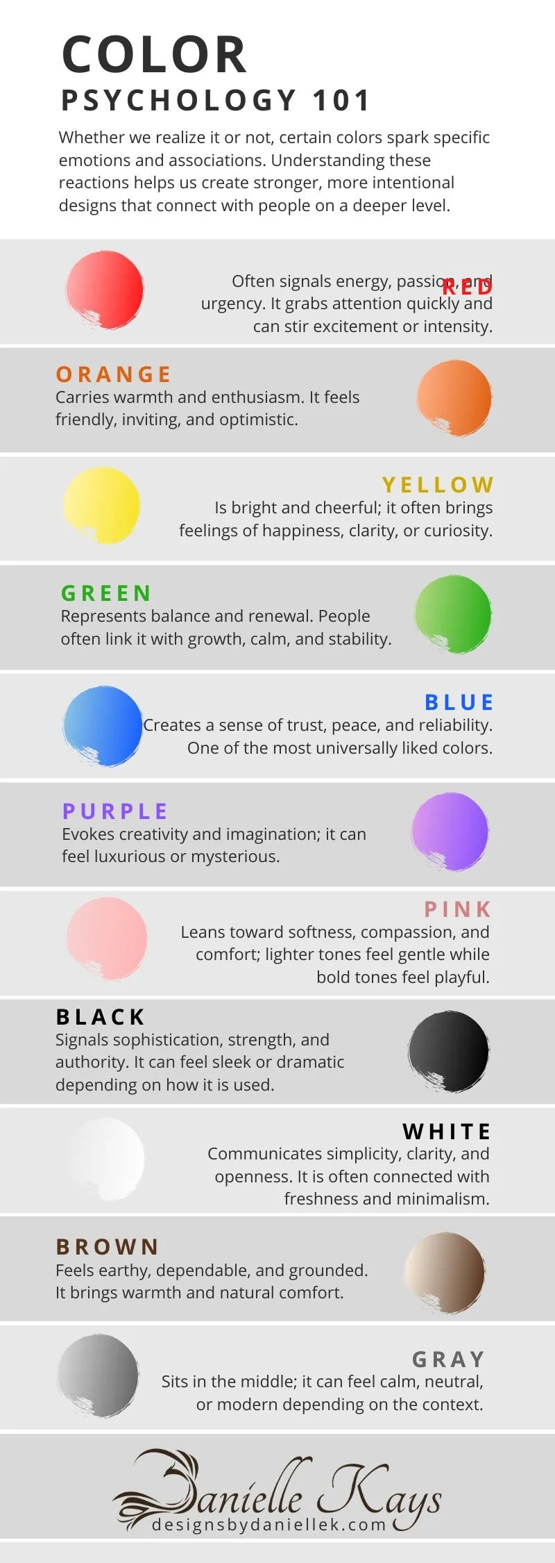
Red often signals energy, passion, and urgency. It grabs attention quickly and can stir excitement or intensity.
Orange carries warmth and enthusiasm. It feels friendly, inviting, and optimistic.
Yellow is bright and cheerful; it often brings feelings of happiness, clarity, or curiosity.
Green represents balance and renewal. People often link it with growth, calm, and stability.
Blue creates a sense of trust, peace, and reliability. It is one of the most universally liked colors.
Purple evokes creativity and imagination; it can feel luxurious or mysterious.
Pink leans toward softness, compassion, and comfort; lighter tones feel gentle while bold tones feel playful.
Black signals sophistication, strength, and authority. It can feel sleek or dramatic depending on how it is used.
White communicates simplicity, clarity, and openness. It is often connected with freshness and minimalism.
Brown feels earthy, dependable, and grounded. It brings warmth and natural comfort.
Gray sits in the middle; it can feel calm, neutral, or modern depending on the context.
“When we understand the emotions behind each color, we gain the ability to design with intention rather than instinct.”
Using color strategically helps shape the tone of a brand, guide a viewer’s eye, and strengthen the message we want to communicate. With color psychology in mind, design becomes more than visuals; it becomes a tool for connection.